
Our Work
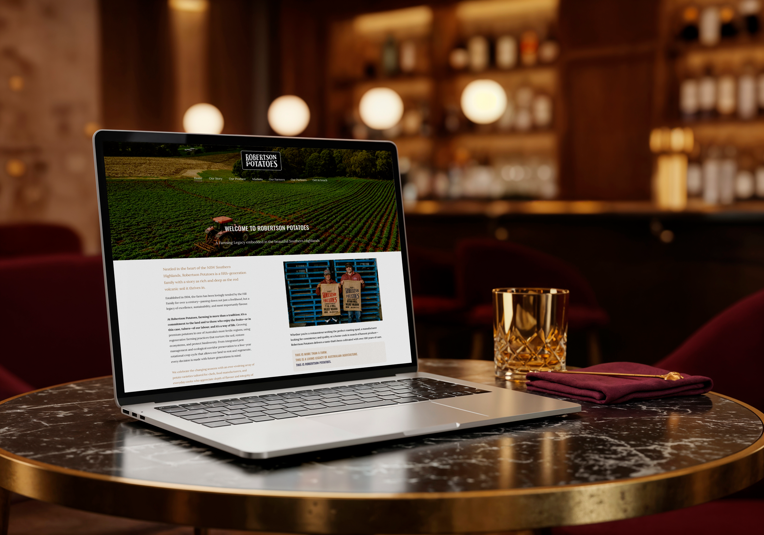
ROBERTSON POTATOES
Robertson Potatoes partnered with us to elevate their digital presence with a modern website that reflects the quality, heritage and scale of their family-owned business. The website was strategically designed to strengthen their brand, showcase their premium produce and communicate their capabilities to customers, suppliers and industry partners. Through a clean, professional user experience and thoughtful content structure, we created a platform that positions Robertson Potatoes for continued growth while reinforcing their reputation as a trusted Australian grower and supplier.
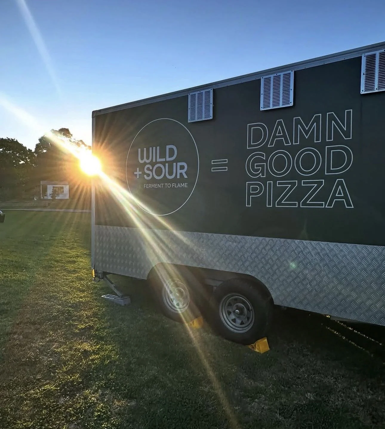
WILD AND SOUR PIZZA
Wild & Sour Pizza partnered with us to create a bold and memorable brand that captured the passion, craftsmanship and personality behind their artisan pizza business. We developed a distinctive brand identity before bringing it to life across their pizza truck signage and custom packaging, ensuring a cohesive and recognisable presence wherever the brand appeared. Every element was designed to reflect the authentic, handcrafted nature of Wild & Sour Pizza while creating a memorable customer experience from the first impression through to the final slice.
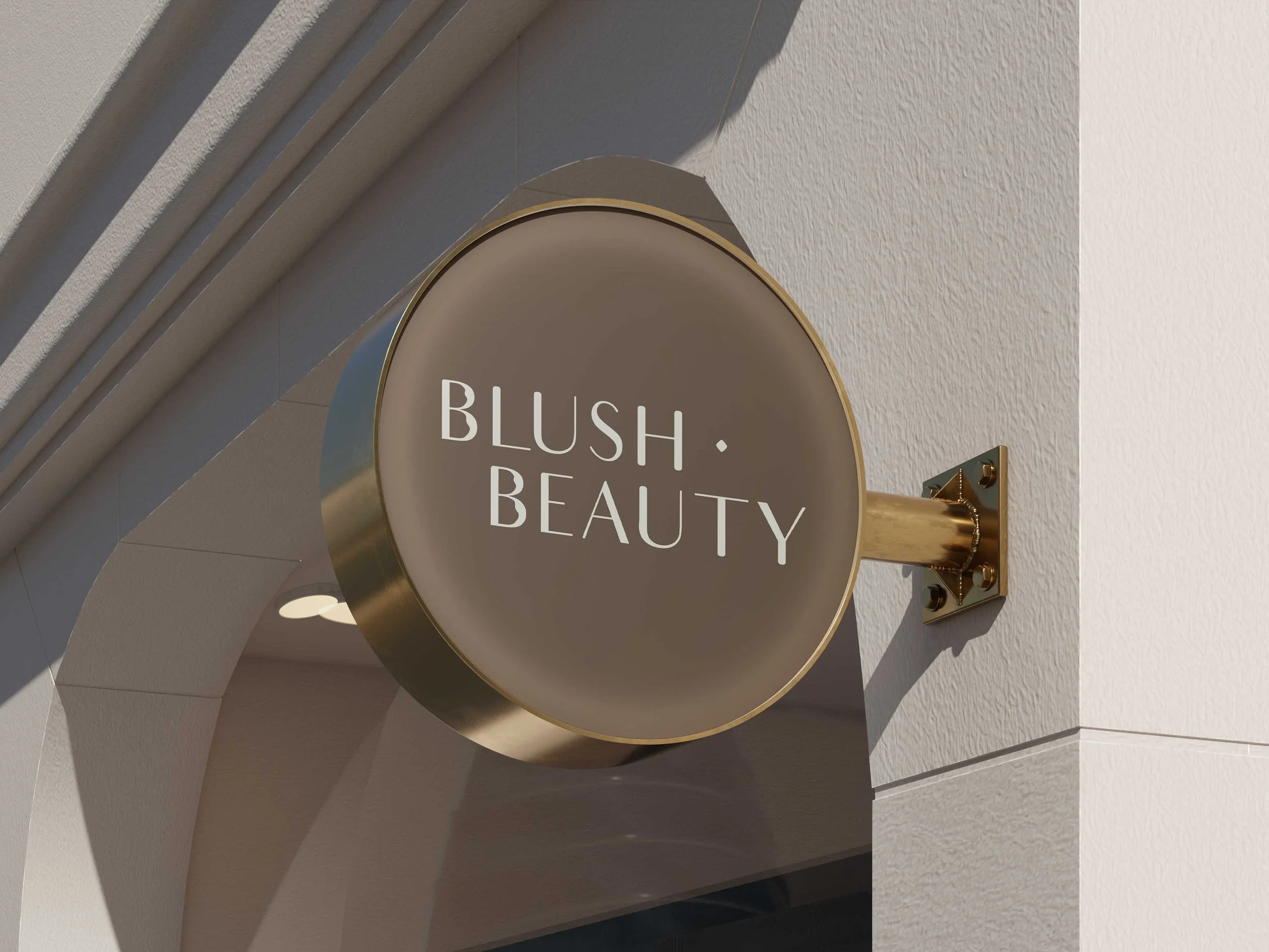
BLUSH BEAUTY
Blush Beauty partnered with us to develop a complete brand identity that reflects the elegance, confidence and personalised experience at the heart of the business. We created a refined and contemporary brand package, carefully crafting a visual identity that positions the salon as both premium and approachable. To complete the customer experience, we also designed the exterior and interior signage, ensuring a cohesive brand presence that carries seamlessly from first impression through to every in-salon touchpoint.
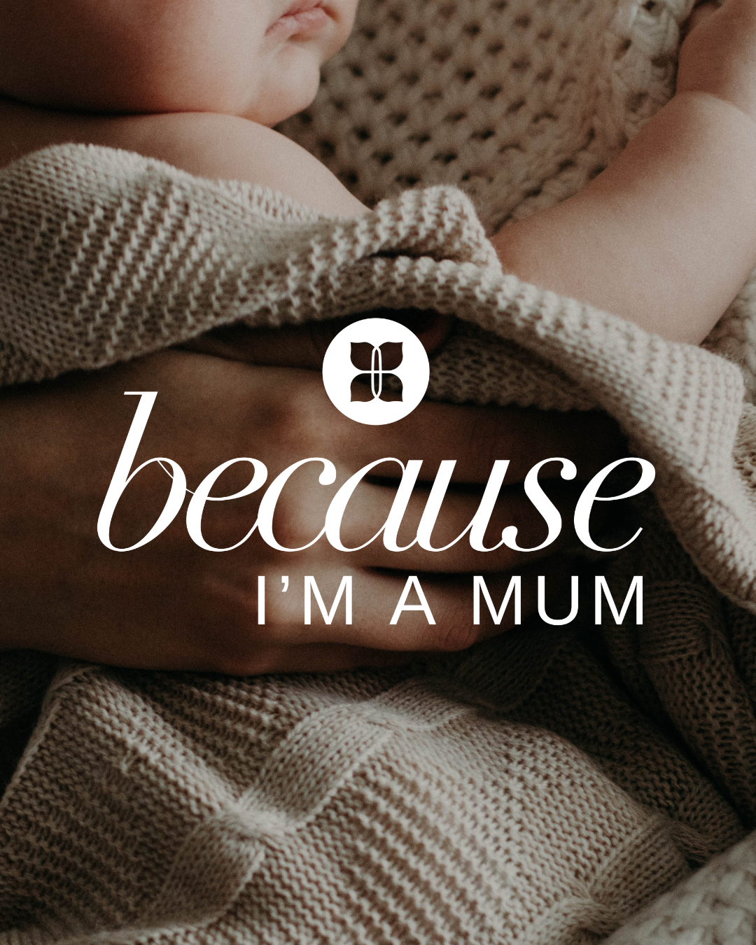
Because I’m a Mum
Because I'm a Mum partnered with us to create a heartfelt brand identity that celebrates and supports the journey of motherhood. We developed a complete brand package that captured the warmth, authenticity and connection at the core of the business, creating a visual identity that resonates with new and expecting mums. As part of the project, we also designed a range of branded merchandise, extending the brand beyond its visual identity to create thoughtful products that foster a sense of community, encouragement and belonging for mothers at every stage of their journey.
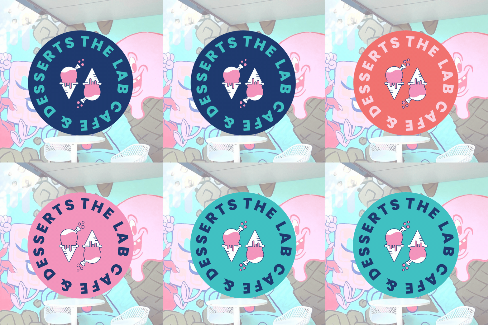
THE DESSERT LAB
The Dessert Lab, Camden partnered with us to create a complete brand experience, from strategy-led visual identity through to the customer environment. We designed the branding, website, menu and in-store signage, ensuring every touchpoint reflected the fun, premium and memorable nature of the business. To further elevate the space, we collaborated with mural artist Le Grizz to develop a custom feature mural that brought the brand to life within the café. The result is a cohesive and engaging brand experience that delights customers from their first online interaction through to their in-store visit.
KHAN DO YOGA
Khanh Do Yoga engaged us to create a brand identity that reflected the calm, intentional and holistic nature of the practice. Through a strategic design process, we developed a visual identity that embodies balance, mindfulness and connection, creating a brand that feels both contemporary and authentic. The result is a refined and memorable identity that captures the essence of the business while providing a strong foundation for future growth across both digital and print applications.
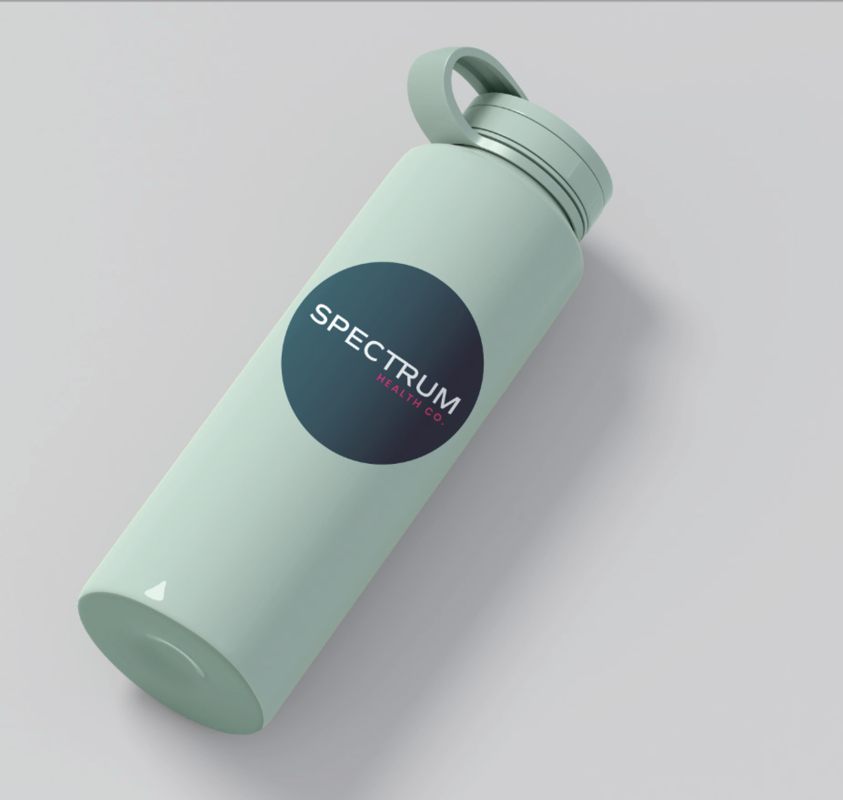
SPECTRUM HEALTH CO.
Spectrum Health partnered with us to develop a comprehensive brand strategy, visual identity and website that positioned the practice as a trusted, modern and client-focused physiotherapy provider. Beginning with a strategic brand workshop, we established the foundations for the brand's positioning, messaging and visual direction before creating a professional identity that reflects their expertise and commitment to personalised care. We then designed a website that delivers a seamless user experience, making it easy for clients to explore services, build confidence in the practice and take the next step towards their health and wellbeing.
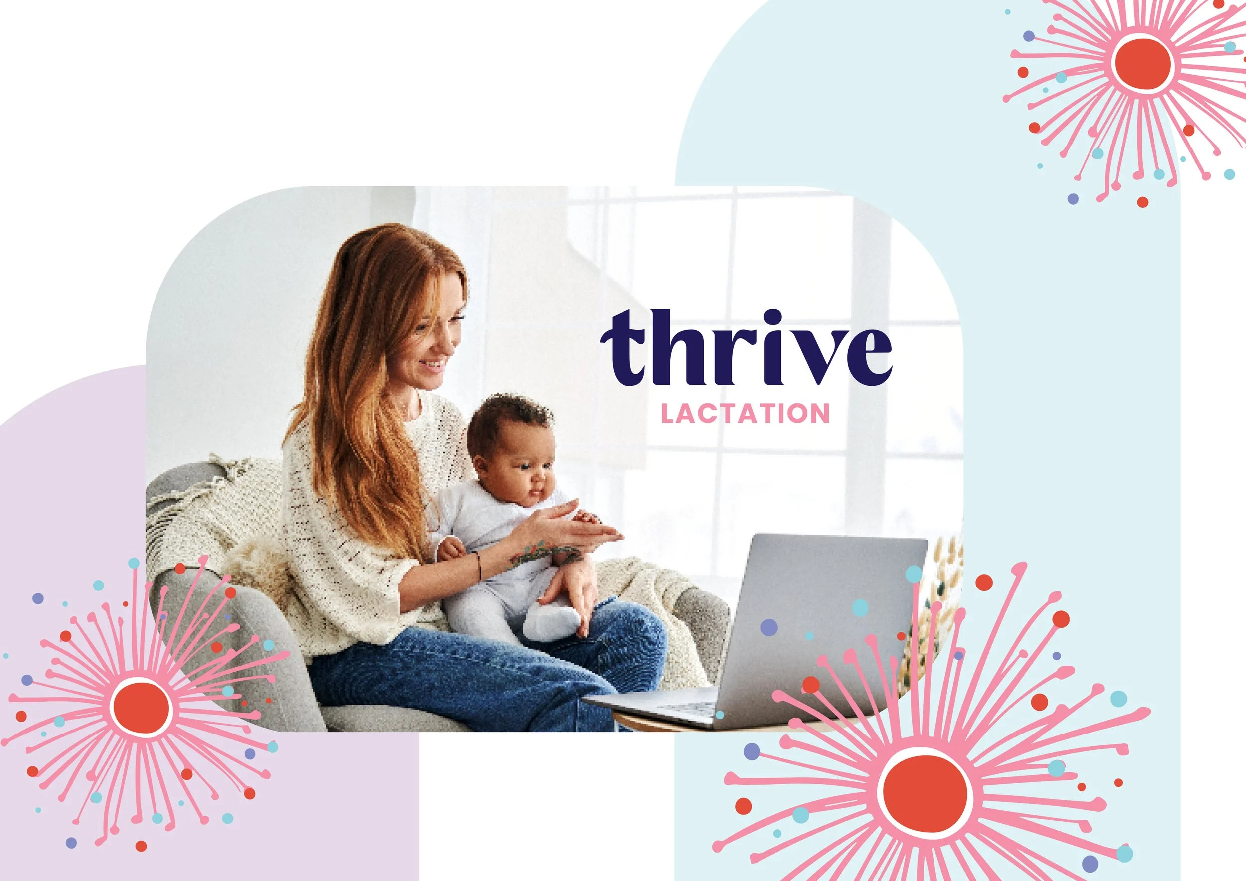
THRIVE HEALTH
Thrive Health partnered with us to create a brand strategy, visual identity and website that reflected their nurturing, knowledgeable and supportive approach to maternal care. Through our brand strategy process, we established a clear foundation for the brand’s positioning, messaging and visual direction, ensuring every touchpoint aligned with the needs of new parents seeking trusted guidance. We developed a warm and approachable brand identity, followed by a website designed to create a calm, informative and user-friendly experience for families accessing lactation and sleep consulting support.
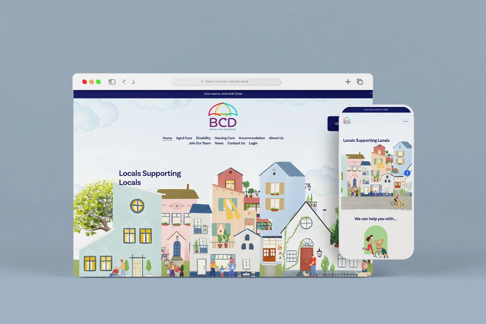
Better Care Delivered (BCD)
Better Care Delivered (BCD) engaged us to create a brand identity and website that reflected their commitment to providing high-quality, compassionate care. We developed a modern and professional brand that communicates trust, reliability and a people-first approach, ensuring the visual identity resonated with both clients and care professionals. The website was designed with accessibility at its core, incorporating user-friendly features including adjustable text sizing to support a more inclusive digital experience. Through clear structure, thoughtful design and accessible functionality, we created a platform that makes it easier for users to understand BCD’s services and connect with their team.
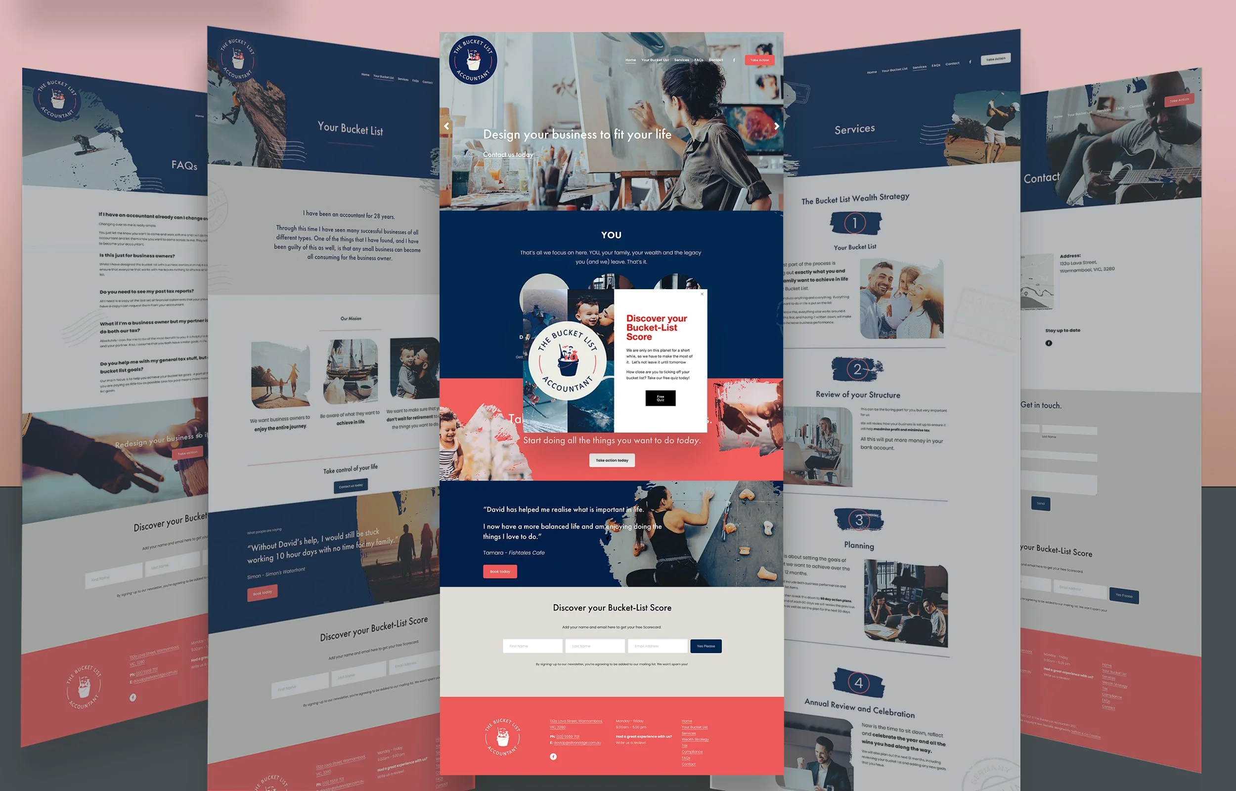
The Bucket List Accountant
The Bucket List Accountant engaged us to develop a bold and memorable brand that challenged the traditional perception of accounting. Beginning with a distinctive brand identity, we extended the visual language across a custom website and a suite of social media graphics, creating a cohesive brand experience at every touchpoint. The result is a modern, approachable and energetic brand that reflects the business's mission to help clients build financial confidence while creating the lifestyle they've always envisioned.
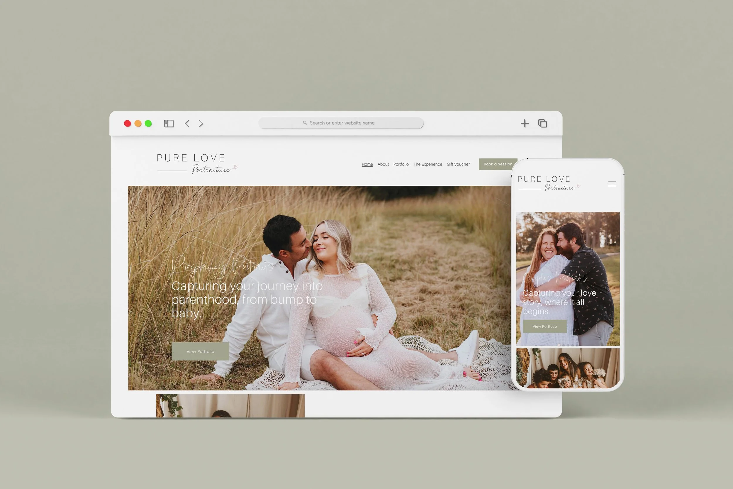
Pure Love Photography
Pure Love Photography engaged us to create a website that captured the emotion, artistry and storytelling behind Cass’s photography. Working within Squarespace, we designed a refined and immersive online experience that allows her beautiful imagery to take centre stage while creating an intuitive journey for potential clients. Through thoughtful layout, typography and visual direction, the website reflects the warmth, authenticity and connection that define the Pure Love Photography brand.

Serene Wellbeing Therapies
Client: Serene Wellbeing Therapies.
Brief: To update and refresh the current branding from a very complex tree to more of a minimalistic branding that looks relaxing and communicates how you will feel after visiting this clinic.
This business provides Yoga Classes, Bowen Therapy and One on one classes.
The Result: A more sophisticated branding that is easy to read, clear and modern. The different formats provided to Rebecca Anderson - means she is able to decide on the best format for the medium she is using.
Rebecca loves her branding, her colour palette and fonts and consistently uses them in her social media marketing.
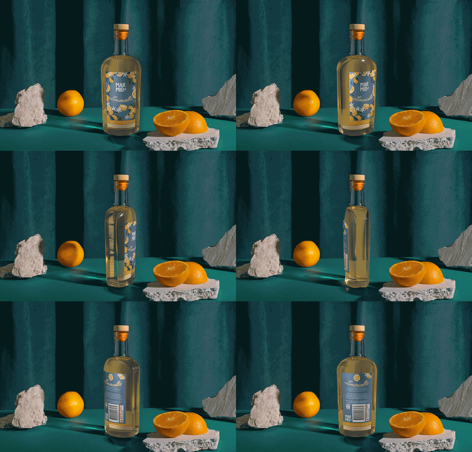
Marmio - Packaging
Client: Marmio
Brief: To create packaging for Limoncello and Arancello that felt fresh, premium and heroed the natural ingredients within the spirits.
The Result:
A vibrant yet sophisticated packaging system that captures the essence of the Mediterranean. Bold citrus tones, refined typography and considered detailing work together to celebrate the purity of the ingredients while positioning Marmio as a contemporary, design-led brand. The final outcome balances shelf impact with elegance — instantly recognisable, confidently premium and unmistakably Italian-inspired.
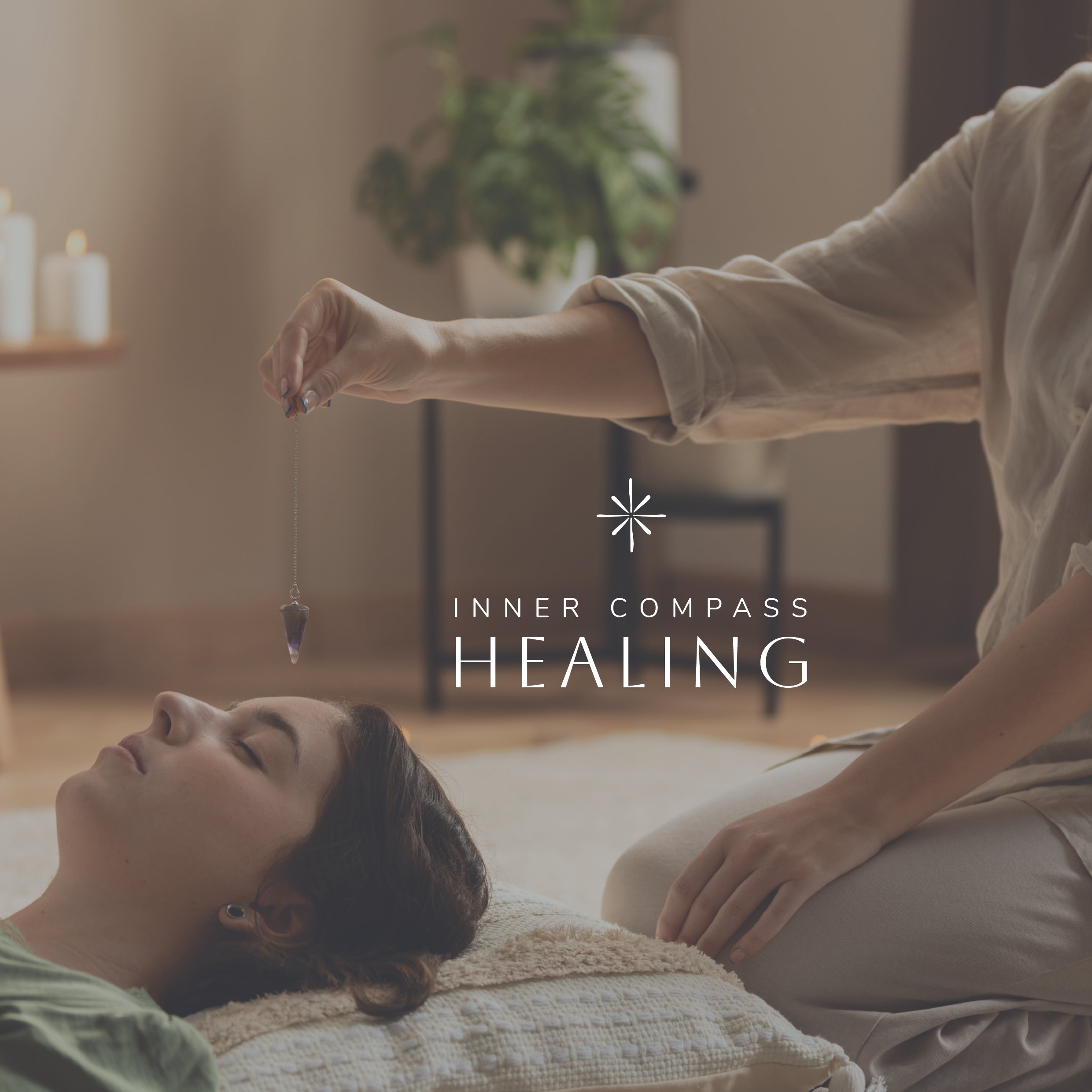
Inner Compass Healing
Shannon is the founder of Inner Compass Healing & offers Classical Chinese Medicine.
The meaning behind the name -
”We believe that true healing starts from within, it's all about trusting your body's inner wisdom. The name encourages you to look within and fall deeper into your inner most being, to follow your 'inner compass' to guide you back into alignment.
We all intuitively get messages from our body - a 'gut feeling' of how we can better care for ourselves and improve our overall health and wellbeing - we just have to listen to the beating heart that is speaking to us.” Shannon Pestana

The Finance Circle
The Finance Circle partnered with us from the foundations of their brand, beginning with a strategic brand workshop to define their positioning, personality and visual direction. We developed a complete brand identity that reflects their approachable, professional and trusted approach to finance, followed by the creation of supporting signage and marketing collateral to bring the brand to life across every customer touchpoint. The result is a cohesive brand experience designed to build confidence, strengthen recognition and communicate The Finance Circle’s commitment to helping clients navigate their financial journey.

The Royal Botanic Garden Sydney
The Royal Botanic Garden Sydney
Educational signage designed to inform visitors of how the plant bank works, the process as a infographic and pictorial diagram.

Kids & Co. Therapy
Kids & Co Therapy required a brand identity and website that reflected the warmth, expertise and personalised care at the heart of their services. We developed a playful yet professional visual identity, incorporating custom illustrations of physiotherapy equipment to create a unique brand world that felt approachable and engaging for children, families and healthcare professionals. The website was designed to bring the brand to life online, creating a welcoming digital experience that clearly communicates their therapy services while building trust with families seeking support for their children.

Grove Financial
Branding Design package designed for Grove Financial - Home & Commercial Loans, Finance, SMSF.
Karyn Wright (Director) of Grove Financial - did the brand workshop with us and from this process we learned that her target demographic of clients are people that are looking to invest in their business or housing. We developed her branding with opulence in mind, wealth building and new homes. The icon symbolises growth - as it is a tree with branches all in perfect symmetry to communicate the work life balance we all strive for.

Delta Aviation Services
Delta Aviation
Local Aviation Services for small aircrafts in Camden, NSW.
Michael came to me initially telling me that they have never really had any branding before, they have purely ran their business via word of mouth advertising. He is 3rd generation in this business and he wanted to give the business a new fresh look that would make his father proud. The passion that Michael has for his business and his family is infectious… we were onboard.
We wanted to give this family business the respect it deserved - we wanted to communicate the history of this business, the craftsmanship and the passion.
Overall they are all very happy with the work we did.

Arcadia Fields
Using Arcadia Fields' established brand identity and style guide, we designed a website that seamlessly translated their visual language into an engaging digital experience. As a leading wholesale supplier of premium cut flowers and plants to florists and retailers across Australia, the website needed to showcase the quality of their products while reinforcing the strength of their brand. Through considered layout, typography and user experience, we created a clean, intuitive website that reflects the professionalism of the business, making it easy for customers to explore their offering and connect with the Arcadia Fields team.


Want to grow your business? Let’s chat.

Request a call-back by completing the form below, or book a free 30-minute consultation with me here.